Diamond Vogel Trend Colors | Winter 2016
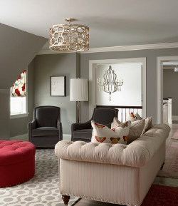
Small Color Additions Inspire Big Style
添加小色彩 激发大风格

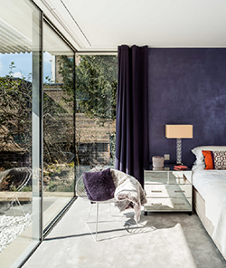
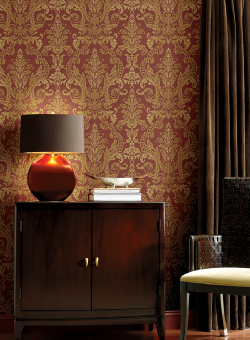
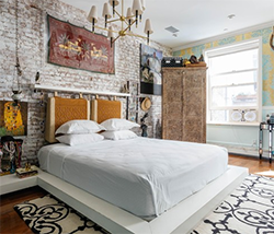
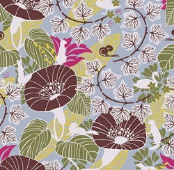
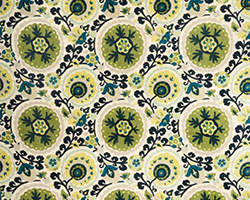
The winter months bring us back indoors to plan our next painting and remodeling adventure. As life changes, so our homes change. Family, hobbies and different lifestyle needs make us reimagine under-utilized rooms in our home. Kid’s rooms turn into offices or formal dining rooms become a cozy reading space. Adding a touch of color can go a long way in making new spaces comfortable. With the current popularity of grays and neutrals, adding colorful accents or inspiration pieces can elevate a room’s style. These inspiration pieces can be found in furniture or spunky artwork, pillows that change with the season or fabrics that add warmth and texture. Small style-packed items are easy to add or move from room to room, making them the smart choice for big impact.
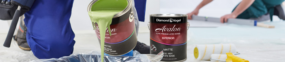
We hope you find inspiration in our 2017 Winter Color Report. Stop by your neighborhood Diamond Vogel for samples of these great colors.
Note: On-screen and printer color representations may vary from actual paint colors.
|
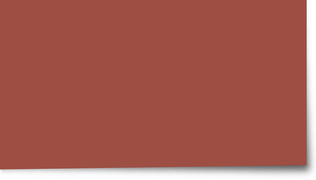 0059 Quintessential 0059 Quintessential
This earthy red is a perfect accent to many of the toned neutrals popular now. Quintessential offers timeless appeal and partners perfectly with muted gold, deep violet and moss-green.
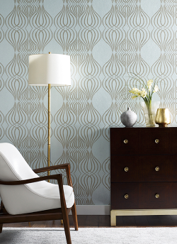
 0227 Moonscape 0227 Moonscape
This soft neutral combines gray and brown for a modern update to this versatile color. Great accent that pairs well with rusty reds, oranges and popular blues.

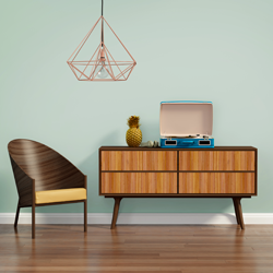
0414 Plume Grass
Muted sage dominates trends with their earthy appeal and offer alternatives to gray for interior walls. The chameleon effect of this toned green offers easy pairing with both warm and cool colors.
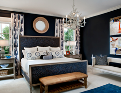
 1320 Blackwater 1320 Blackwater
Is it blue or is it black? A mysterious ultra-deep accent that adds interest to lighter colors like citron, brown, beige and orange.
|
|
 0478 Singing in the Rain 0478 Singing in the Rain
A toned accent that is calming and balanced. A soft mint that pairs well with chocolate, gray, purple and popular neutrals.
 0183 Moth Wing 0183 Moth Wing
Warm and inviting, this beige has a slight gray tone which pairs well with most any color, the perfect neutral.

0269 Sahara Wind
A relaxing gold celebrating ‘authentic workmanship’ with its timeless and warm patina. A saturated hue offering a true connection to comfort.
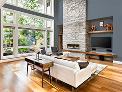
 0218 Drifting Sand 0218 Drifting Sand
This warm toned gray is sophisticated and a great backdrop for other colors that may take a leading role. Pairs well with blue, aqua, yellows and oranges.
|
 |
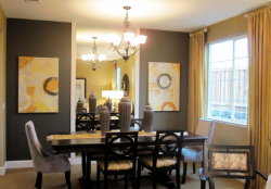
 0634 Day Spa 0634 Day Spa
This saturated navy blue connects spaces, cultures and generations. Its familiar and ageless presence makes it versatile no matter the space. Pairs well with grays, beiges and most hues.
 0462 Resting Place 0462 Resting Place
A soft mint described as ‘nostalgia meets clean and simple’. A mid-century hue that is calming and balanced, creating a restful, quiet escape.

0200 Stoney Field
Earthen fields of mossy velvet; nature’s grounding color that connects brighter colors.
 0667 Blessed Blue 0667 Blessed Blue
A classic aqua that delivers big style . Pairs well with brown, orange, purple and most neutrals
|

 0549 Emu
 0448 Ice Flow