
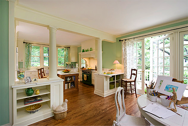
Clawson Architects LLC via Houzz
Creating a cohesive color scheme for your home doesn’t have to be daunting. So, how do you settle on a paint palette that fosters flow? Here are some tips and tricks to consider for color continuity in your home.
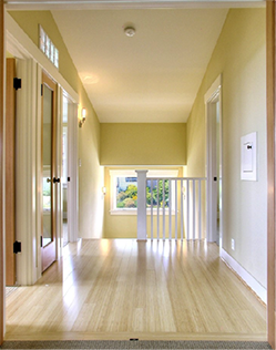
Neiman Taber Architects via Houzz
● Size it up. Pay attention to the style and size of your home. A large, modern home with an open concept leads to different flow (and therefore different color choices) than an older, more traditional floorplan.
● Know your style. Before choosing colors, get an idea of the environment you hope to create in your home. Do you lean toward cool, calm colors or warm, invigorating tones? Do you prefer pops of color or gravitate to neutrals? Doing a little style inventory will help you narrow your preferences and get you on your way to finding a harmonious whole-house palette.
● Go big. Searching for colors that work well together, but don’t know where to begin? Start with what you know -- the largest, most centrally-located room (usually a kitchen or living room). Allow the color you choose for this room to set the tone for the rest of your home’s interior paint scheme.
● Pay attention. Can you see the kitchen from the living room? Noting which rooms are visible to each other will ensure color flow. Have a tough time keeping track? Do a walk-through of your home and sketch a floor plan to stay organized.
● Understand undertone. Narrow your paint choices by choosing the same undertone for the space adjacent to the room you want to paint. If one room is beige with a subtle green undertone and you want to paint the room next to it a blue-gray, try a blue-gray with a slight hint of green.
Source: http://amoroso-design.com
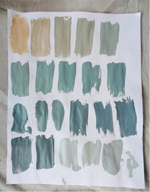
● Find flow. Hallways, entry ways, and landings play a key role in a cohesive color palette. By keeping connecting spaces neutral (pay attention to undertone!), you’ll allow your eyes to rest between more saturated areas. Having a tough time settling between whites, beiges, and grays? Let us do the work for you. Our Whites and Neutrals Color Card provides columns of five colors from light to dark that work naturally together, helping you create a comfortable, seamless space.
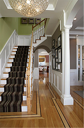
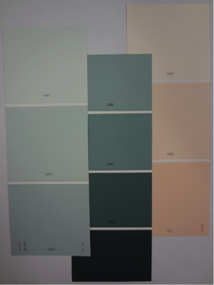
● Narrow it down. Take the stress out of picking a palette for your home by using different shades of the same color. Take a cue from designers: Choose a color strip with light, medium and dark shades from the same color family for a fuss-free selection. The shades will work well together, and add depth and interest to your home. Keep your color palette to three colors using the lightest hues for ceilings, hallways, and small spaces, medium shades for bedrooms and living areas and darkest colors for accents.
● Stay consistent. Keep flow and harmony in your home by keeping ceilings and woodwork the same neutral color.
Meg Padgett via Houzz
A harmonious home is within reach! If you have questions, touch base with the color experts at your local Diamond Vogel Service Center. Our staff will be able to help you select a cohesive set of colors you’ll love for your home.